Houston Sports Design Critique
Recently, a surprisingly passionate discussion erupted in the Satori office regarding aesthetic in sports. It may be a bit unusual to be discussing logos and uniforms rather than the actual competition in sports, but I suppose we’re all just a bit odd. At Satori, we are all about great design. We’re extremely critical of design in almost every industry, so why wouldn’t we take a closer look at the design in this massive institution. Some sports teams are responsible for truly iconic branding; other teams leave us scratching our heads.
What is the essence of great design? Balance. Great design is compelling but straightforward, bold but not too busy, innovative but timeless. It may seem like good design is just a huge list of oxymorons, so to put it simply: you know it when you see it. Let’s look at some familiar looks to better explain.
DISCLAIMER: The views and opinions expressed in this article are likely taken way too seriously by its authors, and are totally subjective and open to further debate and conversation.
The Good:
The Astros logo is criminally underrated. It is simple, bold, and rich in meaning. It resembles a sheriff’s badge of the wild west, but the star also represents the history of space travel in this city. Some may say our uniforms are boring or that they lack creativity. However, it’s important to pay attention to the timelessness of this design.
While new creative uniforms can be fun, chasing trends is dangerous because trends change often. The hope is for a look to remain the same forever. The aesthetic is the visual essence of a product. Our current uniforms may be a little boring, but they will never go out of style. They are classic with a modern color twist. Remember when we had pinstripes? Woof. Our new look is a god sent.

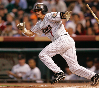
Championships before redesign: 0. After they started sporting their new jerseys, they were awarded with the 2017 World Series title.
The Okay: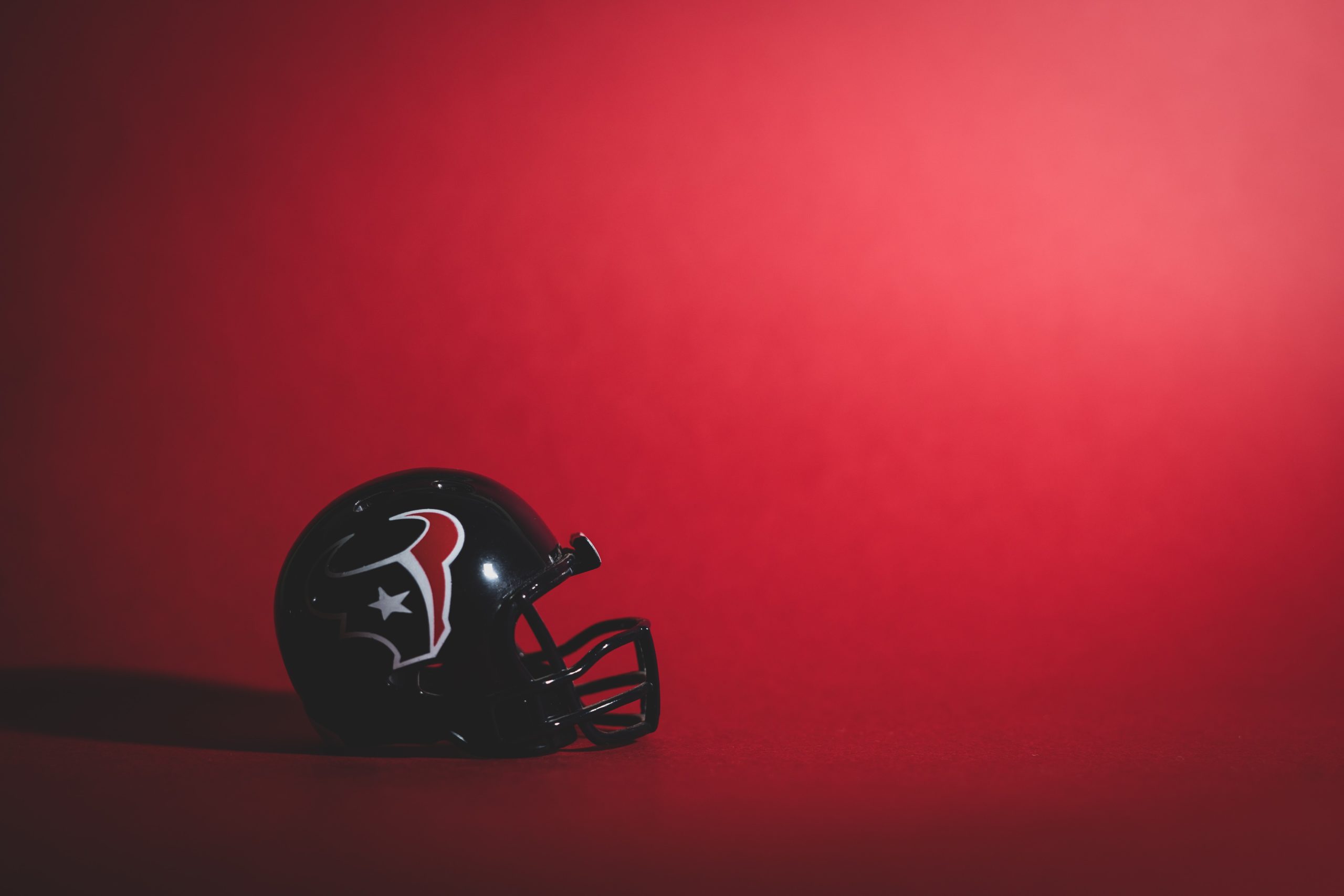
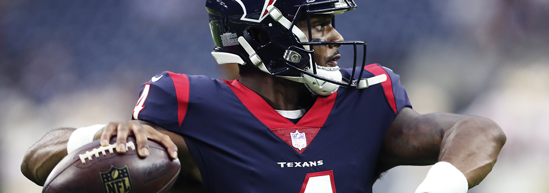
The Texans are close, but they just miss the mark. The color scheme is generic but not bad. The dark “Deep Steel Blue” and the bright “Battle Red” offer great contrast. It may just be disappointing in comparison to the Houston Oilers’ unique “Luv-Ya blue”.
When it comes to the uniform, the organization seems to have done a lot with a little. There are a lot of horrible directions the Texans could have gone with their logo. The numbering and lettering used on the uniforms are unique but simple, and the design of the uniforms are unlike any other in the NFL, while not trying too hard to be unique.
The Ugly: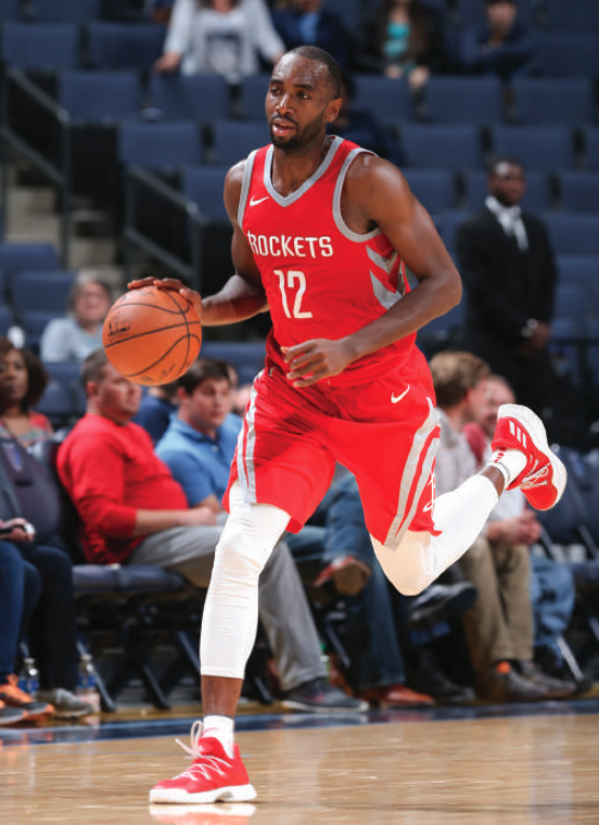
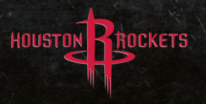
The Rockets took a classic, decades-old look that would probably still look good today and they chased a trend. The only positive aspect of our current logo is that it is completely unique to other teams in the league. The Rockets logo is clever; it is an “R” that doubles as a rocket on a launch pad lifting off. The problem with this is that most people don’t even catch the representation; most people think that the “R” is dripping. It can easily be interpreted as vampiric rather than futuristic.
The uniforms are also visually frustrating. There are rings on the sides of the shorts and jerseys that intend to match each other, but they end up being completely asymmetrical. The red jerseys use gray and white in their uniforms which is unnecessary. The look of the Rockets is disappointing, considering they are often one of the best teams in the league. Not only is their brand mediocre from a design perspective, but nothing about the team or city is represented in the uniform. It’s rough. (Admittedly, the black uniforms are redeeming.)
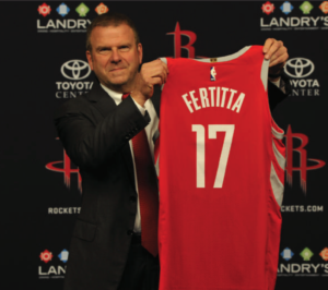
Our only hope is that the new Rockets owner, Tillman Fertitta, is looking for a rebrand. If so, someone should give the man our number. Satori would love to help! What do you think? Comment on one of our social media pages to let us know what team has the best look.